
Ian mentioned at the team meeting that the Parrots Cove logo needed some lovin', so I scribbled this down.
Let me know what you think. If you guys like it, I'll go ahead and do a vector cleanup.
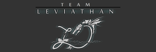
Also, I never recieved comment on the "L" logo for team Leviathan. I'm hoping that was because everyone liked it (lol) but if not, feel free to comment on that as well:

That "L" reminds me of Laverne and Shirley TV show. haha.
ReplyDeleteIs that a good thing, or a bad thing??? ....
ReplyDeleteI like the logos, I do think though that the zone logo should be more like a banner than a badge or stamp. In other words, wider than it is high.
ReplyDeleteTry the same idea, but putting "Parrot's Cove" on one line.